Picking Municipal Bond Funds & The Importance of Low Fees

Due to a lack of tax-deferred space, my current tax bracket, and the current interest rate spread over US Treasury bonds, I started investing part of my portfolio in Vanguard’s tax-exempt municipal bond funds. As a result, I try to read every single muni bond article that Vanguard puts out. In this month’s blog post Municipal debt, Detroit, and diversification, one of the topics covered was the importance of minimizing fund fees.

Research shows that lower-cost mutual funds have tended to perform better than higher-cost funds over time. So instead of worrying about things we can’t control (e.g., how a judge in a municipal bankruptcy is going to decide a case), we should focus on controlling the one variable that we can, which is cost.

The article included the chart below, which plots the net fund expense ratios of municipal bond funds against their 5-year annualized returns.


Source: Vanguard Blog, Morningstar

[Read more…]

Investing Charts for 2013: Looking Beyond a Great Year For Stocks

More charts! The Atlantic has a big collection of 41 economic charts for 2013. Some are neat, some I don’t understand, and some I don’t think anyone really understands. 😉 Here are two investing-related graphs that caught my eye. The first one shows that correlations between multiple asset classes have dropped significantly recently. Submitted by Joe Weisenthal of Business Insider, who states that “one of the characteristics of a crisis is extreme correlation between multiple asset classes: everything trades up or down together.”

The second one shows the cumulative investment inflows into stock and bonds funds over the last year. Submitted by Joshua Brown of The Reformed Broker, who suggests that this shows “America is regaining confidence in the institution of investing again”.

When I see low correlations, it feels like a good time to rebalance your asset allocation. At the same time, it certainly looks like stocks have some momentum right now. Perhaps it’s best just to take a long nap until 2014.

Asset Allocation Revisited: How Much International Stock Exposure For Your Portfolio?

In the post Foreign Stocks For The Long Run, author Rick Ferri recently revisited the topic of how much international stock exposure you should add to your portfolio’s asset allocation. I also have an older post about this – Choosing An Asset Allocation: Deciding On The Domestic/International Ratio – as part of my Rough Guide to Investing series.

One of the reasons to invest in international stocks is for the diversification benefit. While both have historical average returns of 8-10% annually before inflation, they don’t always move in sync (not perfectly correlated). As a result, Markowitz showed us you can attain a higher risk-adjusted return by holding some of both as opposed to just one or the other. So how much of each should you hold?

In my 2007 post, I posted this chart taken from the then-current edition of the bestseller A Random Walk Down Wall Street by Burton Malkiel. It maps the risk/return for portfolios that range from 100% US stocks to 100% EAFA (Non-US Developed countries) for the period January 1970 to June 2006:

From 1970-2006, foreign stocks outperformed US stocks, while the point of optimal risk-adjusted returns was a split of 76% US and 24% Foreign (70% is a typo).

However, the updated data collected by Ferri shows a different yet similar story (see chart below). From 1970-2013, we see that now US stocks outperformed foreign stocks instead, with the point of optimal risk-adjusted returns at 70% US and 30% Foreign.

[Read more…]

Howard Marks Oaktree Client Memo, November 2013

Howard Marks is famous among many investors for his Client Memos as the chairman and cofounder of Oaktree Capital Management. He even weaved many of the older ones into a book, which I read and reviewed. I now try to read every one that comes out. Here’s the most recent client memo dated November 26th, 2013 [pdf]. Below are a few selected excerpts. First, a quick lesson on risk aversion:

Risk aversion is the essential element in sane markets. People are supposed to prefer safety over uncertainty, all other things being equal. When investors are sufficiently risk averse, they’ll (a) approach risky investments with caution and skepticism, (b) perform thorough due diligence, incorporating conservative assumptions, and (c) demand healthy incremental return as compensation for accepting incremental risk. This sort of behavior makes the market a relatively safe place.

In short, it’s my belief that when investors take on added risks – whether because of increased optimism or because they’re coerced to do so (as now) – they often forget to apply the caution they should. That’s bad for them. But if we’re not cognizant of the implications, it can also be bad for the rest of us.

What about now? Marks does see an increase in risk tolerance recently. But how bad is it?

[Read more…]

Blog Flashback: 5 Years Ago, S&P 500 at 750

How time flies. Almost exactly 5 years ago on November 21st, 2008, I was sitting alone in yet another hotel on a business trip in a city that I can’t even remember. CNN was on TV as I wrote the following in a blog post with the title S&P 500 at 750:

While the present looks bleak, the potential for future returns is looking brighter and brighter for long-term investors. The opposite was true a few years ago. If you’re young and still putting money away, this is a good thing! (Although adequate emergency funds should be your first goal.)

Here are selected comments on that post that I admit gave me some doubt:

However, EPS estimates, and therefore valuations, are ridiculously high.

Putting money into a market that represents the old model right now seems like pure folly.

This bear market will last 3-12 years!

I think it’s funny that many of you are down 50% and think that you will break even in a few years, or justify by saying “I’m for the long term”. […] Also, most of the dividends being advertised are based on fantasy (again), just like the EPS, because companies will be cutting them a lot to survive. So no, the S&P isn’t cheap to buy and buy-and-hold is really dead.

[Read more…]

Unexpected and Wise Advice From Financial Advisor Ann Kaplan

I’d never heard of Circle Financial or Ann Kaplan before reading this Businessweek interview, but I found myself bookmarking it for later as she gives a lot of unexpected advice that you usually don’t hear from a financial advisor. For example, let’s take “What’s the biggest financial mistake people make?“. I would say that the majority of advisors would focus on some part of investing as that is how they justify their fees. Something like “they should manage risk better, like I do with my smart-alpha-low-beta asset allocation system”. Instead, Kaplan’s response focuses on spending and priorities (emphasis mine):

The biggest mistake isn’t bad investment choices, it’s overspending. Most people are very surprised when they analyze their spending to discover that a lot of it doesn’t reflect their priorities. Maybe they’re eating out a lot when their priority is travel. Most can cut one-third of their budget by eliminating things they don’t really need, whether that’s buying jewelry or theater tickets. The goal of thinking about this isn’t to encourage you to necessarily cut back but to understand that you can. That helps eliminate fear.

I agree wholeheartedly. From another 2009 Forbes article :

When we study what diminishes wealth, down markets and manager selection are not key figures,” says Kaplan. Instead, it is lack of diversification, overspending and borrowing too much. Build an effective checklist for your road to a healthy portfolio that includes planning, diversifying, monitoring investments, securing tax efficiencies and arranging for appropriate wealth transfer. “All these factors have one thing in common,” says Kaplan. “They are all things we can control.”

Even though she is a former Goldman Sachs partner (which at least to me suggests skill at ruthless profit-seeking), she focuses on the personal/social/behavioral aspect of financial advising and is known for exchanging advice in a group environment:

[Read more…]

Puerto Rico Exposure in Vanguard Tax-Exempt Municipal Bond Funds

Speaking of holding municipal bonds, I’ve been catching up on the troubles in Detroit and Puerto Rico. Last month, there was a flurry of articles warning about mutual funds with high exposure to Puerto Rico bonds, as they were yielding over 9% and trading at 60 cents on the dollar. Most junk corporate bonds don’t yield that much! Yet, they still clung to investment-grade status from the major ratings agencies because if they went any lower, the bonds would crash as many mutual funds would be then forced by their mandates to sell the bonds. Don’t you love ratings agencies?

From NY Times:

For example, the $34 billion Vanguard Intermediate Term Tax Exempt fund [VWITX], the biggest muni bond fund, lost more than 5 percent from May through August. And the largest exchange-traded tax-exempt fund, the $3 billion iShares National A.M.T.-Free Muni Bond fund [MUB], lost 8.3 percent in the same period. […]

In late August, it was Puerto Rico’s turn to roil the market. A Barron’s article detailed the territory’s high debt load and an economy that wasn’t producing enough revenue to easily cover that debt. The S.& P. Puerto Rico municipal bond index fell 10 percent over the next two weeks before the bleeding stopped. Still, the index was down 16.4 percent in the first nine months of the year.

As of 11/19/2013, Morningstar reports the trailing YTD total return of MUB was -2.97% and VWITX was -1.43%. From Reuters:

[Read more…]

Reasons to Buy Actively-Managed Mutual Funds

I would characterize my personal portfolio as 85% passive, 15% active, and 100% low-cost. Why is part of my portfolio managed by people trying to generate “alpha”? Aren’t I supposed to say that index funds are always better? Author and money manager Rick Ferri has a good post about When Active Funds Makes Sense, even he is a well-known index fund advocate.

Here are a few circumstances when I consider an actively managed fund over an index-tracking product:

  1. The absence of a diversified low-cost index fund or ETF that tracks the asset class.
  2. An active fund is lower in cost than an equally diversified index fund.
  3. An active fund has greater diversification than an index product, even if the fee is slightly more.
  4. The unique risk I am trying to capture is better suited to active management than in an index-tracking product.

He then discusses in detail a few categories that satisfy these conditions: municipal bonds, high-yield corporate bonds, and value stock strategies. I was particularly interested in the muni bonds part:

[Read more…]

$30,000 Beat-the-Benchmark Experiment – One Year Update, Prosper and LendingClub

After posting Part 1 yesterday, here is Part 2 of my Beat-The-Market experiment one-year update. In order to test out P2P lending, I started with $10,000 split evenly between Prosper Lending and Lending Club, and went to work lending other people money and earning interest with an 8% target net return.

I tried to keep these portfolios comparable in terms of risk level, while still trying to maximize overall return net of defaults. I reinvested any new money from interest and early loan payoffs regularly for the first several months, but recently I stopped reinvesting my money as aggressively as I was thinking about selling everything (also LendingClub inventory was a little sparse at times). I ended up with $1,044 of idle cash at LendingClub and $862 at Prosper. More on that later.

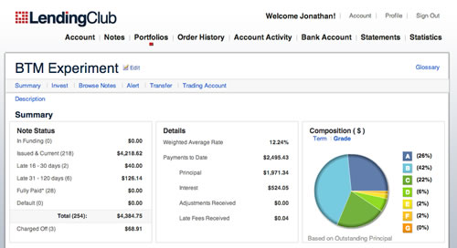
$5,000 LendingClub Portfolio. As of November 1st, 2013, the LendingClub portfolio had 218 current and active loans, 28 loans that were paid off early, and none in funding. Two loans are between 1-30 days late. 6 loans ($126) are between 31-120 days late, which I will assume to be unrecoverable. Three loans have been charged off ($69, two A-rated and one C-rated). $1,044 in uninvested cash. Total adjusted for late loans is $5,304.


(click to enlarge)

[Read more…]

$30,000 Beat-the-Benchmark Experiment – One Year Update, Part 1

It’s finally been a full year since starting my Beat the Market Experiment, a series of three portfolios started on November 1st, 2012:

  1. $10,000 Passive Benchmark Portfolio that would serve as both a performance benchmark and an real-world, low-cost portfolio that would be easy to replicate and maintain for DIY investors.
  2. $10,000 Beat-the-Benchmark Speculative Portfolio that would simply represent the attempts of an “average guy” who is not a financial professional and gets his news from mainstream sources to get the best overall returns possible.
  3. $10,000 P2P Consumer Lending Speculative Portfolio – Split evenly between LendingClub and Prosper, this portfolio is designed to test out the alternative investment class of person-to-person loans. The goal is again to beat the benchmark by setting a target return of 8-10% net of defaults.

I’m splitting this summary up: Part 1 will focus on the Benchmark vs. Beat-the-Benchmark results. Part 2 will include the P2P lending performance. Values given are as of November 1, 2013.

$10,000 Benchmark Portfolio. I initially put $10,000 into index funds at TD Ameritrade due to their 100 commission-free ETF program that includes free trades on the most popular low-cost, index ETFs from Vanguard and iShares. With no minimum balance requirement, no maintenance fees, and no annual fees, I haven’t paid a single fee yet on this account. The portfolio used an asset allocation model based on a David Swensen model portfolio, which I bought and held through the entire yearlong period.

The total portfolio value after one year was $12,095, up 21%. Here’s how each separate asset class fared from November 1st, 2012 to November 1st, 2013 (excluding dividends):

  • Total US Stocks +$986 (+25%)
  • Total International Stocks +$588 (+15%)
  • US Small Cap Stocks +$150 (+30%)
  • Emerging Markets Stocks -$3 (-1%)
  • US REIT +$72 (+7%)

Screenshot of holdings below:

[Read more…]

Consistently Top-Rated 529 Plans: Morningstar Gold and Silver Ratings 2010-2013

Investment research firm Morningstar rates 529 plans in their annual “529 College Savings Plans Research Paper and Industry Survey”. They recently announced their top plans from the 2013 survey, although it appears the full study and state-specific analyst reports are only available in their paid Premium section. Below, I have listed all of the top-rated plans from each of the 2010-2013 survey years, including which plans were consistently top-rated all four years.

Morningstar now uses a Gold/Silver/Bronze rating scale for the top plans and Neutral/Negative for the rest. (In 2010 and 2011, they employed the same methodology but used Top, Above Average, Average, Below Average, and Bottom. Top is now broken up into Gold and Silver, and Above Average is now Bronze.) The criteria include five P’s:

  • People. Who’s behind the plans? Who are the investment consultants picking the underlying investments? Who are the mutual fund managers?
  • Process. Are the asset-allocation glide paths and funds chosen for the age-based options based on solid research? Whether active or passive, how is it implemented?
  • Parent. How is the quality of the program manager (often an asset-management company or board of trustees which has a main role in the investment choices and pricing)? Also refers to state officials and their policies.
  • Performance. Has the plan delivered strong risk-adjusted performance, both during the recent volatility and in the long-term? Is it judged likely to continue?
  • Price. Includes factors like asset-weighted expense ratios and in-state tax benefits.

Consistently Top-Rated Plans 2010-2013

  • T. Rowe Price College Savings Plan, Alaska
  • Maryland College Investment Plan
  • Vanguard 529 College Savings Plan, Nevada
  • CollegeAdvantage 529 Savings Plan, Ohio
  • CollegeAmerica Plan, Virginia (Advisor-sold)

Gold and Silver-Rated Plans 2013 (source)

[Read more…]

International Bonds Now Largest Asset Class in World Market

This Vanguard article included an infographic (see below) that shows the growth of international bonds as an asset class. If you were to consider the world’s investable market as split between bonds and equities, internationally-issued bonds are now the largest piece of the pie at 35%. This includes both government and corporate bonds.

Vanguard believes that holding international bonds is an important way add diversification to your portfolio, and in mid-2013 added international bonds to their Target Date Retirement and LifeStrategy all-in-one mutual funds (currently 20% of the total bond allocation). The Vanguard Total International Bond Index Fund Investor Shares (VTIBX) has an 0.23% expense ratio. I’m still not convinced of their necessity and don’t own any foreign bonds. Back in 2000, international bonds were still 19% of the global market, yet they took up 0% (none) of their Target Retirement and LifeStrategy funds.