Here is a chart that plots out the distribution of annual returns of the US stock market as measured by the S&P Market Index*. Guess where 2008 is so far?
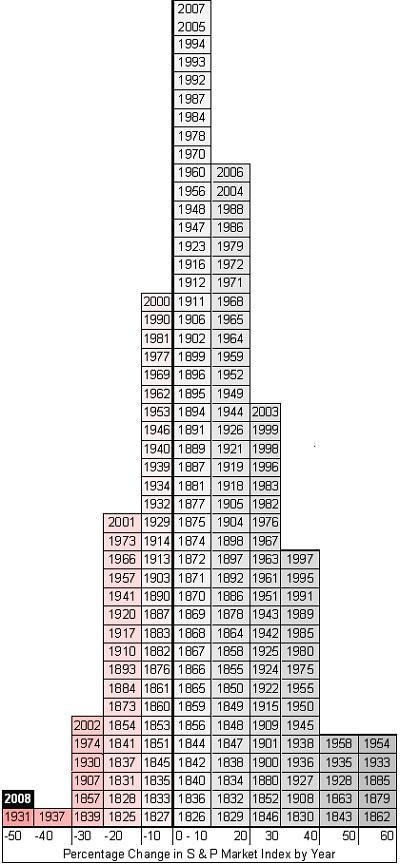
This chart does a great job to fix the assumption that some have that the 8% or 10% annual returns we hear about come every year. Nope, those are just historical averages. Sometimes we lose 40% or more, and sometimes we gain 40% or more – in just one year! So you can’t say today that it will take X years at 8% per year to get back to what you had before. It could take longer, or it could take a lot less.
* The source for this data is a bit vague since both the S&P company and the S&P 500 index did not exist in 1825. Most sources quote Value Square Asset Management, Yale University. I found it via Daily Kos through Bogleheads and Get Rich Slowly. Here is another similar graph. It is not clear if the chart is based on total annual return, or simply a percentage change in price each year, but it looks like the latter. This paper (also from Yale) with data from 1815 to 1925 might be related.

 The Best Credit Card Bonus Offers – 2025
 Big List of Free Stocks from Brokerage Apps
 Best Interest Rates on Cash - 2025
 Free Credit Scores x 3 + Free Credit Monitoring
 Best No Fee 0% APR Balance Transfer Offers
 Little-Known Cellular Data Plans That Can Save Big Money
 How To Haggle Your Cable or Direct TV Bill
 Big List of Free Consumer Data Reports (Credit, Rent, Work)