Goal Update: Home Equity Historical Chart – Nov 2011

We closed on our mortgage refinance about a month ago, the old loan has been paid off, and we are just about to make our first payment on the new loan. Still, I always seem to go back and forth between different possible scenarios of paying down the house quickly or according the “minimum payment” as I call it. Technically, I could just about pay off the house now, if I chose to liquidate my taxable investments and empty out my emergency fund reserve.

I decided to go back and reconstruct a chart of our home equity over time, and compare it to a couple of alternate scenarios.

The red line represents our actual home equity, as a percentage of our purchase price. We use the purchase price because our home is currently worth about the same as when the bought it. An appraisal done for our refinance last month came in at 6% above our initial purchase price. Before the big refinance, we did a haphazard combination up of throwing in a few hundred extra bucks each month and one big lump sum prepayment. Currently, we’re right at 35% home equity.

Just for fun, the dotted red line is an exponential trendline of the red line. It has the loan being paid off somewhere around 2020.

The blue line represents our theoretical home equity if paid according to the normal 30-year payment schedule of our initial 6% fixed mortgage, starting from when we bought the house in the start of 2008. This would have had the loan paid off in 2038.

The green line represents our theoretical home equity if paid according to the normal 15-year schedule of our new sub-4% fixed mortgage, starting from this month. This would have the loan paid off in 2026.

I definitely still want to pay it off in under the current 15-year term, but as usual I like the flexibility. If children come into the picture, we’ll probably cut back on work and slow things down. But for now, I’m still hacking away. We hit the 401k cap already for 2011, so we have some extra cashflow.

By the way, I am only a proponent of paying extra towards your mortgage if you are maximizing your available tax-advantaged accounts like 401ks and IRAs as well as have a nice cash cushion. Although now I do think everyone should consider 15-year mortgages. Who wants to take 30 years to own a home? Most other countries don’t even offer 30-year mortgages, and the government support of 30-year mortgages here simply inflates property prices.

Vanguard Lowers Fees and Improves My Portfolio Performance Again, Offers More Admiral Shares

Last week, Vanguard officially announced the addition of the Admiral share class to six of their existing index funds. Admiral shares have a higher minimum investment amount ($10,000 for those listed below) than the usual Investor shares ($3,000 for those listed below), but with lower annual expenses. Every time my costs and fees go down, my future performance goes up! Below is a list of the newly-available funds, along with an expense ratio comparison.

Funds with new Admiral Shares Investor Shares
expense ratio
Admiral Shares
expense ratio (est)
Vanguard Developed Markets Index Fund 0.22% 0.12%
Vanguard FTSE All-World ex-US Index Fund 0.35% 0.18%
Vanguard Mid-Cap Growth Index Fund 0.26% 0.10%
Vanguard Mid-Cap Value Index Fund 0.26% 0.10%
Vanguard Small-Cap Growth Index Fund 0.26% 0.10%
Vanguard Small-Cap Value Index Fund 0.37% 0.21%

The only one I am converting over this time is the Small Value fund. However, I did notice that this now means that for every single Vanguard stock index fund I choose to own, I can choose between both Admiral shares and ETF versions. I like mutual funds because they always trade at NAV and don’t have bid/ask spreads, as well as the ability to schedule automatic monthly investments. ETFs have the advantage of not having any purchase or redemption fees and the ability to be trade in any brokerage account. I went into more detail on the Vanguard mutual fund vs. ETF decision process here.

Vanguard even has a cost comparison tool for mutual funds vs. ETFs. But long-term expenses for me are no longer a concern because they are almost identical with all these Admiral shares. (I suspect the Small Cap Value differential is only temporary.) Here’s the list:

Funds In My Personal Portfolio ETF
expense ratio
Admiral Shares
expense ratio (est)
Vanguard Total Stock Market Index Fund 0.07% 0.07%
Vanguard Small-Cap Value Index Fund 0.23% 0.21%
Vanguard Total International Stock Index Fund 0.20% 0.20%
Vanguard Emerging Markets Stock Index Fund 0.22% 0.22%
Vanguard REIT Index Fund 0.12% 0.12%

I wrote previously about why I invest in the Vanguard Total US and Total International market funds. Want to convert your Investor shares to Admiral shares before they are automatically converted eventually? It just takes a clicks online – here’s a quick guide [pdf]. Want to convert your mutual funds to ETFs? Check out this post on Vanguard mutual fund to ETF share conversions. It turns out you can also do so easily with minimal tax implications.

Build A Complete Stock Portfolio With Just Two ETFs: Vanguard Total US (VTI) and Total International (VXUS)

If you are constructing your own portfolio and like the idea of low-cost, passively-managed index funds, you should definitely be aware that just two ETFs that can provide you diversified exposure to stocks worldwide and all at rock-bottom fees. Given how many choices there are out there today, I can’t assume that everyone knows about these already.

The Vanguard Total US Stock index fund invests in over 3,000 stocks that represent the entire U.S. stock market, from small-cap to large-cap companies. The smallest company on their holding list is 100 shares of Qualstar Corp, worth a mere $200. The entire company is worth about $20 million. Compare that to the largest holding of Apple, worth $380 billion (that’s 19,000 times larger). The ETF and Admiral shares have a mere 0.07% expense ratio ($7 annually per $10,000 invested), which is taken out in tiny amounts daily out of the fund’s net asset value. That’s just 6% of what the average mutual fund charges. There are three versions:

  • Vanguard Total Stock Market ETF (VTI)
  • Vanguard Total Stock Market Index Fund Investor Shares (VTSMX)
  • Vanguard Total Stock Market Index Fund Admiral Shares (VTSAX)

The Vanguard Total International Stock index fund invests in over 6,000 stocks that covers 98% of the world’s investable markets excluding the US (“ex-US”). This includes 44 countries from the “European, Pacific, and emerging market regions, as well as Canada.” The fund also includes both small-cap and large-cap companies from these countries. The ETF and Admiral shares charge a 0.20% expense ratio. Three versions as well:

  • Vanguard Total International Stock ETF (VXUS)
  • Vanguard Total International Stock Index Fund Investor Shares (VGTSX)
  • Vanguard Total International Stock Index Fund Admiral Shares (VTIAX)

This graphic shows you how these two funds relate to other Vanguard ETFs you may already be aware of:


(Source, brighter red text is added by me)

(I should also mention that there is the Vanguard Total World Stock ETF (VT), which covers the entire world in one tidy fund. However, it only holds 2,904 stocks total, which is nearly 2/3rds less than a VTI/VXUS combo. On top of that, it charges a 0.25% expense ratio, which is nearly double how much a VTI/VXUS combo would cost when weighted appropriately. I personally think the added diversification and lower cost is worth the hassle of owning two separate funds.)

Implementation

As of August 31, 2011, the world market value breaks down to about 42% US and 58% Ex-US. For simplicity, I chose to own VTI and VXUS in a simple 50/50 ratio as part of my target asset allocation. I rebalance back to 50/50 regularly using new cashflows, and also at least once annually. Bonds are a separate discussion.

Side note: The reason I thought of writing this is that I previously held Vanguard FTSE All-World ex-US ETF (VEU) as my primary international holding, which as you can see above is a subset of VXUS, but realize that VXUS only arrived earlier this year. I’ve shifted most things over already, but I have been hesitant to sell some of my taxable holdings because I’d owe capital gains taxes. I noticed yesterday that I am actually at slight loss now (yay?), so I am able to do some tax-loss harvesting by selling my VEU and swapping it for VXUS. Since they are not “substantially identical” funds, I am not subject to wash sale rules.

Social Security, Ponzi Schemes, and Realistic Expectations

Recent political debates have brought up comparisons between Social Security and Ponzi schemes. (Have you read the book about the real Ponzi?) Even though seemingly every single economist on Earth has weighed in, this discussion has been around for so long that the Social Security website already has an entire page dedicated to addressing it. To summarize, yes Social Security shares some traits with Ponzi schemes in that money from new participants goes to earlier participants. However, it relies on a rather straightforward transfer and does not depend on an exponential growth of new participants to be sustainable. It is, however, sensitive to demographics.

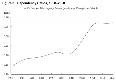
Social Security is a pay-as-you-go system. What I pay into Social Security today goes straight to a current retiree’s Social Security check. When I retire, my paycheck will be supported by a younger worker’s taxes. It is not an investment. It is not a savings account. The problem is, that the ratio of workers to retirees is getting rather low. In 1950, there were 7.3 working-age people for each person over 65; now, the ratio is 4.7 to 1, and it is scheduled to drop to 2.7 to 1 by 2035. [Source]

Since people are living longer as well, the reality is that for a 30-something like me, the math works out that there is little chance that we will get the same level of relative benefits that current retirees get. However, there will be no sudden Ponzi-like implosion. Now, the government could smooth this transition out even more if they do the hard thing and do some combination of higher taxes, extending retirement ages with higher life expectancy, or lowering benefits. But politicians are usually reactive as opposed to proactive, so don’t count on it. That’s too bad, because people are more dependent on Social Security than ever. 70% of all eligible folks can’t even wait until 65 to start taking benefits, many as early as 62, even though that means lower payments and likely a lower total benefit. This is why in general financial experts say you should wait as late as possible to get a higher payment for the rest of your life.

Of course, Medicare is even worse. Take this analysis via this WaPo article:

Consider an average-wage two-earner couple together earning $89,000 a year. Upon retiring in 2011, they would have paid $114,000 in Medicare payroll taxes during their careers. But they can expect to receive medical services – including prescriptions and hospital care – worth $355,000, or about three times what they put in. […] The same hypothetical couple retiring in 2011 will have paid $614,000 in Social Security taxes, and can expect to collect $555,000 in benefits.

Vanguard Target Retirement Income Fund vs. Vanguard Wellesley Income Fund

There’s a ways to go, but we’re still aiming to retire within the next 10 years. As such, I’ve been thinking about what happens when we want to live off of withdrawals from our retirement portfolio. According to the passively-managed Target Date funds by Vanguard, if you reach retirement you’re directed to the Vanguard Target Retirement Income fund. Another popular option for retirees is the Vanguard Wellesley Income Fund, which has been around for over 40 years, and is actively-managed by Wellington Management Company, an advisory company that has been around since the Great Depression. Let’s take a quick look to see how these two funds compare.

Vanguard Target Retirement Income Fund (VTINX)

This fund seeks to provide “current income and some capital appreciation”. The approximate asset allocation is 30% stocks, 65% bonds, and 5% cash. It is a fund of funds, holding the Vanguard Total Bond Market II Index Fund, Vanguard Total Stock Market Index Fund, Vanguard Inflation-Protected Securities Fund, Vanguard Prime Money Market Fund, and Vanguard Total International Stock Index Fund. Here is the current asset allocation per Vanguard as well as the equity and bond style boxes from Morningstar.

Number of stocks held: 9,958 (3,323 US + 6,635 Foreign)

Number of bonds held: 4,486 (4,450 nominal bond + 36 TIPS bonds)

Expense ratio: 0.17% ($170 a year on a $100,000 balance)

Vanguard Wellesley Income Fund Admiral Shares (VWIAX)

This is an income-oriented balanced fund, which is another way of saying the same thing as above. The approximate asset allocation is 35% stocks, 65% bonds. I am choosing the Admiral shares as opposed to the Investor shares because the great majority of people using this for their retirement will reach the $50,000 minimum balance. Here is the current asset allocation per Vanguard as well as the equity and bond style boxes from Morningstar.

Number of stocks held: 60

Number of bonds held: 559

Expense ratio: 0.21% ($210 a year on a $100,000 balance)

Commentary

The overall asset allocation of the two funds is very similar, especially since you could consider cash/short-term reserves as bonds. However, how they are constructed is very different. Target Retirement is passively indexed on a market-cap weighted distribution and holds nearly 10,000 stocks from around the world. Wellesley is actively-managed to include only 60 selected dividend stocks from primarily large, US companies.

As for bonds, Target Retirement follows another market-weighted index of the Barclays Capital U.S. Aggregate Float Adjusted Bond Index. There is a large chunk of US Treasury, US Treasury Inflation-linked, and US Agency mortage-backed bonds. Wellesley is mostly in corporate investment-grade bonds.

Wellesley is produces more of it’s returns as income through stock dividends and the higher bond yields from corporate bonds, with a current SEC yield of 3.28%. This allows the psychological benefit of possibly spending only the dividends that the fund distributes every quarter. However, there is the concern that 60 stocks is not enough diversification, or that their bond analysts might drop the ball. Here is the growth chart of $10,000 (click to enlarge):

At least historically, the managers of Wellesley have added value. Will it continue? Unknown. The good news is that with such low costs, there’s one less reason to expect underperformance in the future. These are just an example of what is out there, although on some early retirement forums I see folks simply holding a 50/50 split of these two exact funds. Sometimes I think everyone should just start with these kind of low volatility funds in the first place, and just reinvest dividends.

U.S. Savings Bonds Have Outperformed Stocks Since 1998?

A reader recently told me that he was no longer investing in the stock market after seeing the chart below from the Savings Bond Advisor. It shows the total portfolio value after investing equal monthly amounts in either the S&P 500 stock market index or Series I US Savings Bonds. The time period is from September 1998 (when “I Bonds” started being sold) through August 1, 2011. My comments follow.

The past returns of savings bonds are indeed pretty good, but not likely to be repeated. Series I Savings Bonds (I Bonds) were the new thing in 1998, and the government offered some really enticing interest rates on them. I Bonds have a fixed component that lasts for the duration of that specific bond and an variable component that adjusts with inflation every 6 months. From 1998 to May 2001, the fixed component was always between 3% to 3.60% above inflation (source). However, since May 2008, the fixed rate has been between 0% and 0.7%. For the past year, the fixed rate has been a big fat zero. I would love to have a savings bond paying 3% plus inflation (currently 2.30%), as some current bondholders have, but I don’t expect that to ever happen again.

Now, that doesn’t mean that they aren’t still a competitive investment, especially for the short term. Since interest rates are so low, I still buy savings bonds even at a 0% fixed rate as part of my emergency fund cash reserves.

Savings Bonds are being slowly killed by the government. Even though savings bonds have historically encouraged people of all income levels to save, it appears that the US Treasury is slowly killing the savings bond. As recently as 2008, you could buy $30,000 worth of each type of savings bonds a year, per person. For a while, we were able to even use credit cards to buy them without a fee. Today, you can only buy $5,000 of paper I-bonds and $5,000 of electronic I-bonds a year, and even paper savings bonds are being phased out in 2012. (You can still overpay your taxes and buy paper bonds with a tax refund in 2012.) There was even a NY Times article last week entitled Save the Savings Bond. Basically, even if you wanted to create your retirement portfolio with savings bonds, you can’t.

Investing solely in inflation-linked bonds is actually recommended by some financial authors. The thing is, the government has so much debt that it greatly prefers US Treasury bonds which can be sold by the billions. Printing a $50 savings bonds is not even a drop in the bucket, it’s closer to a H2O molecule in the bucket. What you can invest in is Treasury Inflation Protected Securities (TIPS), which like I Bonds are backed by the government and pay an interest rate linked to inflation. Economics professor Kolitkoff in the book Spend ‘Til The End recommends your entire portfolio to be TIPS. The problem? You’re gonna have to save a lot. TIPS yields are very low, currently offering yields of negative 0.7% above inflation (!) for a 5-year bond to a meager 1.1% above inflation for a 30-year bond. If you’re okay with saving 50% of your income every year for 30 years, then this plan might work for you.

There is no easy answer as to the best place to invest right now. I am sticking with a diversified low-cost portfolio with both stocks and bonds (including a nice chunk of TIPS inside, which has done quite well recently), and you can see with this chart that it has also done pretty well the last decade.

Swensen Portfolio 10-Year Total Returns: Low-Cost Diversified ETF Portfolio Results

Last week, I shared a chart that showed how a diversified portfolio that was rebalanced regularly still managed to nearly double in value over the last decade. Here’s another similar finding based on the David Swensen portfolio as compiled by an advisor group called ETF Portfolio Management.

Swensen manages the Yale University endowment and wrote an excellent investment book called Unconventional Success (my review) directed towards individual investors. Even though he does active management himself, he explains why low costs and low turnover are critical, how certain asset class are better than others, and why rebalancing regularly is important. He ends up providing a model portfolio made up of what he calls “Core” asset classes. Here’s the slightly updated David Swensen Portfolio with his recommended 70% stocks / 30% bonds breakdown. Actual low-cost index ETFs are included via ticker symbols.

30% Domestic US Equity (VTI)
15% Foreign Developed Equity (VEA)
10% Emerging Markets (VWO)
15% Real Estate (VNQ)
15% U.S. Treasury Bonds (IEF)
15% Inflation-Protected Securities (TIP)

Instead of the Total Bond Index from last week, which include everything from Treasuries to corporate bonds to mortgage-backed securities, the Swensen bond allocation only has nominal and inflation-linked Treasury bonds. The chart below shows the growth of $1,000 invested this way (eMAC) at the start of 2001 until the end of July 2011. (Last week’s chart included the start of 2000 to end of 2009.) The ETFs listed above were bought and rebalanced annually. eMAC stands for “efficent multi-asset class”.

Again, we see that the diversified and rebalanced portfolio has done well over the last 10 years, more than doubling in value. Check out their annual returns breakdown (summarized below), and you can see how in any single year different asset classes will have different returns. Some go up, some stay steady, some go down. This lack of strong correlation is what helps smooth out your portfolio, and makes you feel better that at least something is doing okay at any given time.

Now, this may not be the ideal portfolio going forward. Nobody knows the future, you can only do what you think gives you the best odds for success. But it does serve as another real-world example of how low-cost diversification works and that you should have good reasons for holding each of the asset classes that you buy.

(The “HF Index” indicated stands for the Dow Jones Credit Suisse Hedge Fund Index, which claims to track ~8,000 hedge funds and thus tracks overall hedge fund performance. After poking around their website, the returns seem to be net of manager fees.)

Buy, Hold, and Rebalance! How Patient Investors Still Quietly Grow Their Money

There is a lot of uncertainty in investing, and it always seems like especially now. Buy and hold has been called dead many times. However, if you look carefully, you’ll find that there are many people who have quietly grown their portfolio over the last decade using the boring principles of diversification, low-costs, and regular rebalancing. I would also add proper tax planning helps as well.

Here is some data from a WSJ article by Burton Malkiel (author of Random Walk Down Wall Street) that helps illustrates this. (Can’t view the article? Use this Google the title trick and click the first link.) The article is from several months ago, but the S&P 500 index back then was almost exactly the same as yesterday: 1,193 vs. 1,195.

The chart below shows the growth of $100,000 invested at the start of 2000 until the end of 2009. As you can see, a 100% stock investment (in green) would have ended up at $93,717. Thus the term “lost decade for stocks”.

But what happens when you mix in some other assets, and rebalanced them annually? The red line is a portfolio consisting of 67% stocks and 33% bonds, all in low-cost index funds. The stock breakdown was 27% US, 14% Developed International, 14% Emerging Markets, and 12% REITs. The result was a ending balance of $191,859, which means an investor in 2000 could have, without special psychic powers, nearly doubled their portfolio over the same “lost decade”.

The diversified portfolio above matches rather well with my own asset allocation. For one, my AA also has 50/50 US/non-US split plus a chunk in REITs. Although I started out 85% stocks/15% bonds, I am now closer to 75% stocks. I have also rebalanced annually to maintain that ratio, but I do feel that my portfolio has still grown past my contributions even though I haven’t tracked my personal returns as well as I’d like.

Regular rebalancing is key. That is, keeping your target asset allocation by buying what is going down, and selling what is going up, in order to keep your desired risk profile. Both in early 2009 and last week, I was buying stocks. While there is debate on this, I believe that there is a reversion-to-the-mean effect that boosts your returns.

Investment Portfolio Update: Asset Allocation & Fund Holdings – July 2011

This an update for my investment portfolio, including 401(k) plans, IRAs, and taxable brokerage holdings. There have been only a few small changes since my last portfolio update. As always, this is our own personal portfolio and may not necessarily be completely applicable to anyone else.

Asset Allocation – Target vs. Actual

I separate the stock and bond portions for clarity. My target asset allocation remains the same:

Here is my actual stock allocation, where it shows that I am slightly overweight US Total and will need do some light rebalancing.

My actual bonds allocation is not really worth making a chart for… the target is 50%/50% and I have 47% short-term nominal bonds and 53% inflation-protected bonds.

Stocks vs. Bonds Ratio

[Read more…]

Don’t Let 401(k) Auto-Enrollment Decide Your Contribution Rate For You

The Wall Street Journal has a rather surprising article 401(k) Law Suppresses Saving for Retirement regarding a recent law that allowed employers to automatically enroll their employees into their 401(k) retirement plans. The goal was to encourage saving and make contributing a certain percentage rate the default option for workers, after which they could change the contribution rate to whatever they wanted (even zero). Before now, the default option was usually little more than passing out a brochure.

Auto-enrollment seemed like it was working. More workers than before were using 401(k) plans. The problem was, the default percentage rate for most plans was about 3%. It turns out that for some people that 3% is actually less than the 5-10% than people might have chosen on their own if started from zero. As a result, the study showed that 40% of workers ended up actually saving less after auto-enrollment began. Talk about unintended consequences!


Source: WSJ (Click to enlarge)

Possible reasons include inertia (aka laziness), but I suspect that if a company sets it at a certain percentage, then there can be a subconscious belief that such a number is the “recommended” or “approved” contribution rate. In reality, that 3% appears to be chosen simply to be low enough as to avoid workers opting-out immediately. In other words, much lower than what would be required to fund a proper retirement.

The study noted was done by the Employee Benefit Research Institute, which actually wrote a rebuttal article that focused on the fact that auto-enrollment is increasing the savings rate for many people, especially those with lower incomes. The problem is not with auto-enrollment itself, but more with tinkering with the default contribution rate. Another potential tool is an “auto-escalation” feature that increases employee savings rates by a set amount each year, say 1%, to encourage more savings over time.

When it comes down to it, the study pretty much reaffirms the original conclusion that started auto-enrollment in the first place. Lots of people are too busy, forgetful, uneducated, or scared to make the proper financial decisions for themselves. Don’t rely on your employer to decide how much to save for retirement.

Everyone has a different situation, but if you don’t have a pension or other significant retirement assets, your overall savings rate is probably going to have to be more than 10% if you expect to replace most of your income upon retirement. The tax advantage of traditional and Roth 401ks is very significant over time. Finally, if you have an employer match available, don’t say no to free money!

Debt, Debt, and More Debt

After seeing this household debt bubble chart, I’ve been especially sensitive to news about consumer debt. Here are some recent stats from across the spectrum:

Mortgages
According to real estate data firm CoreLogic, 22.7% of US homes with a mortgage had negative equity in the first quarter of 2011, meaning the outstanding mortgage amount was greater than the value of the property. That’s 10.9 million of them, and another 2.4 million had equity of 5% or less, which means with any further drops they’ll be in danger as well.

Nevada was the state with the biggest share of homes underwater, at 63% of all mortgaged properties, followed by Arizona (50%), Florida (46%), Michigan (36%), and California (31%). Goodness.

Home Equity Loans
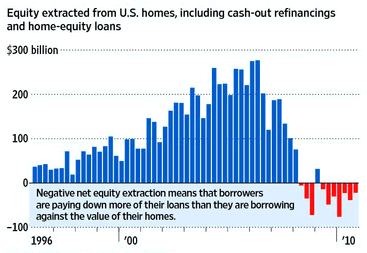
The same report also found that a hefty 38% of borrowers who took cash out of their residences using home-equity loans are underwater. By contrast, only 18% of borrowers who don’t have these loans were underwater. Check out all the home equity extracted up until 2008, which is slowly being paid back now.

Is there some good data about what all this money bought?

401(k) Loans
Human-resources consulting group AON Hewitt reports that nearly 30% of 401(k) participants currently have a loan outstanding, the highest in recent history. On a purely interest-rate level, these loans can actually be a pretty good deal. (Don’t listen to the double-taxation myth perpetuated by Suze Orman and others.) However, you have the potential penalty of losing the preciouis tax-deferred benefit plus a 10% penalty if you don’t pay it back in time (and if you lose your job, it’s due even sooner). Still, having nearly a third of all people dipping into their retirement money can’t be a good thing.

Sources: ConsumerAffairs, LA Times, WSJ, SmartMoney

Vanguard Lower Minimum Investment On Target Retirement Funds to $1,000

Effective May 11st, Vanguard has lowered the minimum initial investment on their Target Retirement Funds to $1,000, down from $3,000. Thank goodness, as this avoids having everyone pointing out that the Vanguard STAR fund was the only one with a minimum of $1,000. But seriously, I think this is a smart and overdue move by Vanguard, as it allows investors with limited funds to start out investing in a low-cost, diversified investment that adjusts with age. I put my own mother’s Rollover IRA in a Target Retirement Fund a couple years ago, and I sleep well at night.

(See previous post on the Vanguard Target Date Retirement Funds Glide Path to see how the asset allocation changes over time. I kept my mom’s target date close to their default recommendation, as my dad’s retirement accounts are on the conservative side.)

What if you have less than $1,000? There are plenty of “how to invest with just $100” posts out there, and if I look back I’ve probably done one myself. However, my new advice is this: Don’t bother. Instead, focus your energy on investing in yourself, by either learning about investing in general or improving your career and business skills. Put what you have safely in the bank, now once you have $1,000, then stick it in a Target Retirement Fund via a tax-advantaged IRA.