Research Affiliates Custom Portfolio Expected Returns Tool

crystal_ball_hp

Investment advisory firm Research Affiliates has updated their interactive Asset Allocation tool, which now provides estimates of expected returns for more than 130 asset classes and model portfolios. There are two expected return models, “valuation-dependent” and “yield-plus-growth”. In addition, you can input your own custom asset allocation.

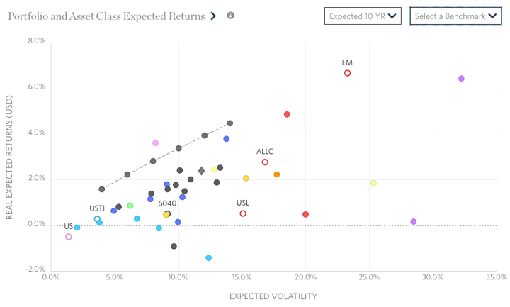
My initial reaction is that while the tool got new bells and whistles, it also became more confusing to navigate and harder on the eyes. Here’s a screenshot of their scatter plot showing the expected risk and return for several asset classes under their valuation-dependent model.

raf_aa1

I created a custom portfolio “CustomMMB” using my current portfolio asset allocation and it is charted below on their risk/return map. In a separate window (not shown) you can see how each individual asset class contributes to the total expected return.

raf_aa2

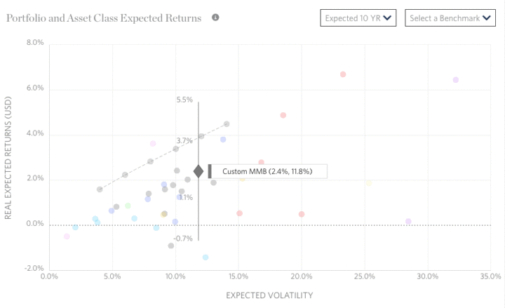
As you can see, my portfolio did not offer the maximum expected return for its risk level. The RA efficient model portfolio that did includes an exotic mix of asset classes, including Emerging Markets bonds (non-local currency), Bank Loans, US Private Equity, European Private Equity, and direct investments into US Commercial Real Estate (not through REITs). Unfortunately, I’m not even sure how to access many of those asset classes.

I appreciate that they freely share their research methodology and results, specifically covering the valuation perspective. US Equities have historically high valuations, but interest rates are also at historically lows. The next 10 years should be interesting…

Another portfolio analysis tool that lets you input your specific asset allocation is PortfolioCharts.com Safe Withdrawal Rate calculator. This Research Affiliates tool says my expected 10-year real return is only 2.4% (equates to a nominal expected return of 4.6%). The PortfolioCharts.com tool says the same personal asset allocation has a historical perpetual withdrawal rate of over 4% over a 40-year timeframe.

PortfolioCharts.com Safe Withdrawal Rate Tool (Updated)

eggosI just noticed that PortfolioCharts.com has updated their Withdrawal Rate Calculator. It has improved visualizations and as a personal finance geek I even found it fun. You can enter your specific asset allocation slices down to 1% and see customized results.

The Withdrawal Rates calculator shows the safe withdrawal rate for any asset allocation over a variety of retirement durations based on real-life sequence of returns. Those looking to retire early or leave money to heirs can also see the perpetual withdrawal rate that protected the original inflation-adjusted principal.

You can read about the specifics behind these improvements here. You should also read all the assumptions here. For example:

The withdrawal rate is the percentage of the original portfolio value used for one year of retirement expenses. Each year, expenses are adjusted for inflation (not for portfolio size) to maintain constant purchasing power.

Briefly, a “safe” withdrawal rate (orange) allowed a portfolio to go as low as $1 but never hit zero at the end of the timeframe. In other words, the ride could have still gotten quite hairy for a while. A “perpetual” withdrawal rate (green) never ended up less than the initial principal, even adjusted for inflation. The author Tyler recommends the perpetual WR for early retirees or for people who desire to leave an inheritance for heirs.

Here is the specific chart for my current portfolio asset allocation:

pcharts_me

I would be quite happy with being able to confidently withdraw over 4% (+ inflation adjustments) of my portfolio for the next 40 years. The short-term drawdown paths can still be scary though. The usual caveats with using backtested data also apply.

Playing around, I noticed that the simplest way to change things up was by adding a healthy chunk (~20%) of gold instead of stocks. This seemed to significantly improve the perpetual withdrawal rates in the short-term (0 to 15 years). It’s too bad I still don’t have a firm fundamental understanding of gold. If you can’t maintain faith in it when things are scary, then you shouldn’t own it in your portfolio.

New Low-Cost Broad Commodity ETFs from GraniteShares

bcom

Commodities are an asset class that some investors include in their portfolio for diversification purposes. Depending on the specific index, you might track the futures market for aluminum, coffee, copper, corn, cotton, crude oil, gold, diesel, lean hogs, live cattle, natural gas, nickel, silver, soybean meal, soybean oil, soybeans, sugar, unleaded gas, wheat, and zinc (image source).

In my experience, when commodities prices have been hot, you see them in a lot of portfolios. When commodities prices have been cold (as they have been recently), you don’t read about them as much. Via ETF.com, there are now a new wave of commodity ETFs that hope to gather assets as the next up-cycle begins.

Here are some of the reasons why people didn’t like commodity ETFs in the past (besides the volatility and poor past performance):

  • Higher costs. Expense ratios for most commodity ETFs were above 0.50% annually, with many closer to 1%
  • Late K-1 tax forms. Most commodities ETFs issued Schedule K-1 forms at tax time, which not only were an extra form to file but they also tended to come very late in the year. You might have all your 1099s by the end of January, but your K-1 might not trickle in until March or even April.
  • Some were actually exchange-traded notes (ETNs), which carried credit risk as they were technically unsecured debt obligations of the issuer. In contrast, ETFs hold securities separately in trust with a custodian. If an ETF issuer fails, you still own the underlying assets.

Here are two new ETFs that address the issues above with (1) have lower costs and (2) a new structure that doesn’t issue K-1 forms:

  • GraniteShares Bloomberg Commodity Broad Strategy No K-1 ETF (COMB) – This ETF is technically actively-managed, but is benchmarked against the Bloomberg Commodity Index (BCOM). It is structured as a 1940 Act funds and thus does not issue K-1s. The expense ratio is 0.25%. Fact sheet.
  • GraniteShares S&P GSCI Commodity Broad Strategy No K-1 ETF (COMG) – This ETF is technically actively-managed, but is benchmarked against the S&P GSCI commodity Index. It is structured as a 1940 Act fund and thus does not issue K-1s. The expense ratio is 0.35%. Fact sheet.

The 0.25% expense ratio of COMB makes it the cheapest broad commodity ETF available today. (The ETFS Bloomberg All Commodity Strategy K-1 Free ETF (BCI) has an expense ratio of 0.29%.) Now, the following bit from this ETFTrends article brings up the worry that this “no K-1 structure” might produce tracking error against the index.

In an attempt to help investors avoid K-1s, the ETFs do not invest directly in commodity futures but rather gains exposure to these investments by investing a portion of its assets in the GraniteShares BCOM Cayman Limited, a wholly-owned subsidiary of the Fund organized under the laws of the Cayman Islands. The subsidiary is not an investment company registered under the Investment Company Act of 1940 and has the same investment objective and will follow the same general investment policies and restrictions as the funds.

If you don’t buy the futures directly, what are you buying? Are you saying that you are buying a subsidiary that does buy the futures directly? How does that indirect structure change your investment performance? I don’t know and I don’t plan on buying either ETF, but I thought I’d point it out. ETF.com doesn’t seem to be worried:

Technically, both COMB and COMG are actively managed, but in practice, they are mostly passive funds. The futures portion of the portfolio, up to 25%, is held in a subsidiary based in the Cayman Islands and generally reflects the index, while the collateral is held in a cash portfolio holding fixed-income securities that is managed stateside.

The GraniteShares ETFs above only launched 5/22/17 and the last time I checked ETFdb.com only had about $2.5 million in assets so it is too early to make any judgments. The CEO of GraniteShares is William Rhind, who formerly worked at Blackrock/iShares and as the CEO of the popular SPDR Gold Shares ETF (GLD).

If you like low-cost access to the commodities asset class, this looks to be a positive development. I personally choose not to invest in this asset class as I think the long-term returns will be lower than that of equities. (Lower costs should improve the return outlook, however.) Commodities funds may offer the draw of being a diversification “hedge”, but I don’t want to pay the price of lower returns, high volatility, and higher complexity. There are many smart minds that disagree, so do your own research as well.

Don’t Switch Between Cheap Index Funds To Save Money (Try Cheap Milk Instead)

I’ve seen this Schwab commercial multiple times recently, where Schwab touts that one of its index funds costs “3X less than Fidelity” and “4X less than Vanguard”:

I already knew why it bugged me every time I saw it, but I finally ran the numbers. Never mind that this is one cherry-picked fund. Let’s play their game. The index fund in question is the Schwab S&P 500 Index fund at a 0.03% expense ratio. The comparison is the Vanguard 500 Index Fund Investor Shares (VFINX) with an expense ratio of 0.14%. On an investment of $5,000, this works out to $1.50 a year vs. $7 a year. That’s a difference of $5.50 a year, or under 50 cents a month.

But wait, there’s more. Once you reach a $10,000 balance, the Vanguard 500 Index Fund Admiral Shares (VFIAX) will automatically decrease to an expense ratio of 0.04%. Now the difference is $1 per year. That’s 8 cents a month. Schwab funds have been far more expensive than Vanguard for decades, and now that they are bragging about saving you less than 50 cents a month?

Finally, the only way that Schwab can do this is in the first place is that these index funds are a loss-leader. Here’s an excerpt from the Morningstar article Penny-Pinching Index Fund Investors May Pay a Price, which also warns fundholders before switching index fund providers as the tax hit could take decades to overcome.

Existing shareholders in these funds are clear winners in the fee war. But as this race to the bottom nears its inevitable ending (free beta), these investors’ savings will increasingly be measured in dollars and cents. In my mind, these latest exchanges will likely do more to move the needle for fund firms and brokerages like Schwab. In many settings, these low-cost building blocks are simply loss leaders, a cheap gallon of milk meant to entice consumers into the store in hopes that they’ll grab some Cheetos and a pack of gum before they get to the counter.

I think that Schwab has many positive attributes to point out overall, but this commercial was deceptive. I’m happy that low-priced, broadly-diversified index funds are more readily available, but the idea that Schwab is significantly cheaper than Fidelity or Vanguard is laughable. The real numbers show that you could save more money by regularly buying discounted milk than by switching $100,000 from Vanguard to Schwab.

If you haven’t started investing yet, you will most likely be fine with any low-cost provider – iShares, Vanguard, Fidelity, Schwab. If you’ve already started, the absolute cost difference is too small to warrant a change.

Real-World Example of Why High-Cost Index Funds Are The Worst

costsmatter

Here’s another reminder that in the world of investing, having low costs is more important than owning “passive” index funds. Why? The simplest argument is that index funds can have high expense ratios.

Anyone can open an account at Vanguard, Schwab, Fidelity, or TD Ameritrade and purchase an S&P 500 index fund with expenses of about 0.05% a year. That works out to $50 a year on a $100,000 balance.

Meanwhile, the following companies have the most expensive S&P 500 index funds on the market. These happily charge you $1,000 to $2,300 a year on a $100,000 balance while investing in the same companies in the same amounts. Credit to Meb Faber for compiling this list.

500expensive9

These could be considered the worst mutual funds out there. Why? If you buy an actively-managed stock-picker fund, at least you have the possibility of outperformance (for a little while at least). You bet on red in roulette even though there is zero and double-zero. With an expensive index fund, you have zero upside. You can’t win. You didn’t even bet on double-zero. Instead, you essentially lit 1% of your money on fire.

Let’s look at the real-world performance of Rydex S&P 500 Fund (RYSYX) and the Vanguard 500 Index Fund (VFINX). Here’s a Morningstar chart showing the relative performance of the Rydex S&P 500 Fund (RYSYX) and the Vanguard 500 Index Fund (VFINX) from the inception of the Rydex fund in mid-2006. This is a “Growth of $10,000” chart, and you can see how the gap just keeps widening over time.

500expensive2

Here’s a quick takeaway from this chart:

  • Someone who invested $100,000 in the Rydex S&P 500 Fund (RYSYX) from 5/31/06 to 5/21/17 (~11 years ago) would now have $185,183.
  • Someone who invested $100,000 in the Vanguard 500 Index Fund (VFINX) from 5/31/06 to 5/21/17 (~11 years ago) would now have $235,948.
  • That is a difference of over $50,000 with no luck involved as both are passive funds that that legally promise in their prospectus to track the S&P 500 index.
  • Let me repeat: That’s a difference of $50,000 on a $100,000 starting balance over only 11 years! That is real money; actual dollars that someone will not have to spend in retirement. Imagine what that number could grow into over 30 years of saving.

Isn’t that horrible? Now, consider that the reason why someone would buy these funds in the first place was probably due to a human advisor putting their client in such a fund. Therefore, there is the possibility of another layer of advisor fees on top of the fund expense ratios. (Or they could be options in a bad 401(k) plan. It would be really scary if these were the best options on a plan menu.)

I can’t understand how these companies can get away with charging so much for doing so little. According to Morningstar, the State Farm S&P Index fund (SNPBX) currently has $1.4 billion in assets and the Invesco S&P 500 Index fund (SPICX) has $1 billion in assets. Billions of dollars? Why are so many people buying this stuff?!

Real-World Example of Sequence of Returns Risk

portpie_blank200

The standard investment advice is the older you get, the more bonds you should hold in your portfolio. There are various rules of thumb like “Age in Bonds” or “Age minus 20 in Bonds”, and so on. On the other hand, stocks have higher historical long-term returns, so shouldn’t we keep as much in stocks as we can?

It’s not just about the long-term average return, you also have to worry about the sequence of returns. I’ve shared a hypothetical example of sequence of returns risk before, but Will Street Project has a great post called Why Drawdowns Matter that illustrates this effect using real-world numbers.

From 2000 to 2016, the overall total return of the S&P 500 Index (large US stocks) and the Barclays US Aggregate Bond Index (broad US bonds) was roughly the same. The sequence for stocks was bad then good. The sequence for bonds was basically a slow, gradual line upwards. Stocks thus lagged bonds for most of the period but caught up and even surpassed bonds a bit by the end.

Here’s what would have happened if you started with $100,000 in either the S&P 500 or the US Aggregate Bond Index and kept on buying $500 per month:

500plus

Here’s what would have happened if you started with $100,000 in either the S&P 500 or the US Aggregate Bond Index and kept on selling $500 per month.

500minus

The difference is that in the top chart you are adding money (and thus buying stocks at a lower price during the bear markets), while in the bottom chart you are taking out money (and thus selling stocks at a lower price during the bear markets).

It is important to note that things would look different if stocks shot up initially and then tapered off, as opposed to stocks struggling initially but then going back up at then end of the period. However, we can’t control the sequence of returns in our own retirements, so we have to be prepared.

One solution is to hold more bonds (or single-premium immediate annuities). Another solution is to use a dynamic withdrawal strategy so that you’re taking out less money during a down market.

If someone promises to pay you back, they probably won’t pay you back.

everylies

Back in the stone age of P2P lending (aka 2006), I used to read through Prosper loan listings one-by-one. Borrowers would outline their monthly budgets showing how they could afford their loan payments, along with explanations of why they needed the money (credit card debt, home improvement, etc.) and why they would pay you back (steady job, good credit history, etc). I’m not sure if this is even an option anymore, but in any case, I wasn’t very good at it.

The New York Magazine article How to Predict If a Borrower Will Pay You Back (excerpted from the new book Everybody Lies) discusses an academic paper that actually analyzed keywords within past Prosper listings against their default history. Consider the following 10 phrases:

  • God
  • promise
  • debt-free
  • minimum payment
  • lower interest rate
  • will pay
  • graduate
  • thank you
  • after-tax
  • hospital

Half of them are used by people most likely to pay back the loan. The other half are used by people who are least likely to pay back the loan. Care to venture a guess which are which?

Generally, if someone tells you he will pay you back, he will not pay you back. The more assertive the promise, the more likely he will break it. If someone writes “I promise I will pay back, so help me God,” he is among the least likely to pay you back. Appealing to your mercy—explaining that he needs the money because he has a relative in the “hospital”—also means he is unlikely to pay you back. In fact, mentioning any family member—a husband, wife, son, daughter, mother or father—is a sign someone will not be paying back. Another word that indicates default is “explain,” meaning if people are trying to explain why they are going to be able to pay back a loan, they likely won’t.

The phrases used by folks who are most likely NOT to pay back their loans are God, promise, will pay, thank you, and hospital. If someone promises that they will pay you back, they probably won’t pay you back. The more emotions are involved, the less likely they are to pay you back.

This is an interesting wrinkle as lending is such a huge part of the investing world – mortgages, bonds, insurance, and so on.

Buffett and Munger: S&P 500 vs. Berkshire Hathaway

brk2016letInstead of watching the entire 6-hour Berkshire Hathaway (BRK) annual shareholder’s meeting, I first read through the WSJ highlights and then watched selected parts of the Yahoo Finance replay which interested me.

One interesting topic was about Warren Buffett and Charlie Munger’s directions to their heirs. Buffett has famously directed his wife to put 90% of her assets into a Vanguard S&P 500 index fund and 10% into US Treasuries. In contrast, Munger has told his family “not be so dumb as to sell” their Berkshire stock. Why do they differ?

You can see this question at the 1:39:55 marker in the video. Here are my notes:

  • Buffett initially tries to deflect this question by stating that 100% of his BRK stock will be given to charity. However, there would be nothing stopping her from buying BRK shares (or any other investment) at a later time, so that doesn’t really answer the question.
  • Both Buffett and Munger have previously stated that they believe that Berkshire will likely perform better than the S&P 500 in the future.
  • Buffett’s wife will have more money than she needs. Maximizing upside is not important. Downside protection is most important.
  • In terms of investment performance, both are quite unlikely to suffer permanent loss, but the S&P 500 is still a little bit more reliable than BRK. There is still some chance that there could be a change in culture or executive leadership that might damage the company. Someone might succeed in breaking up Berkshire into parts.
  • The 10% in short-term US Treasuries (essentially cash) goes even further, in case there is long severe depression or even if the stock exchange is closed, there will be cash on hand to handle things.
  • In terms of human issues, it would be a news event if she had BRK shares and sold them. The media would care. Talking heads would offer alternatives. However, if she holds the S&P 500 index fund, that is so boring that it is quite likely nobody will ever bother her again. From all that I have read, never being bothered again sounds like something she would enjoy. (Most people don’t even know her name or what she looks like.)
  • Munger concedes that the S&P 500 as well-constructed as a diversified portfolio of large companies. In terms of performance, it is “all but impossible for most people [to beat].” However, he’s still telling his family to stick with Berkshire.

Buffett and Munger are exceptionally rational as opposed to emotional. Therefore, both answers will most likely work out fine. Sometime in the next 50 years, the stock market will probably drop 50% again. The fact that Buffett thinks the S&P 500 is safer than even Berkshire is something to remember the next time there is a stock market crisis.

At the same time, Munger’s comments should make a current BRK shareholder feel more secure in holding shares for decades to come. Even with Buffett’s shares going to charity, there will still be a large chunk of shareholders with a long-term view.

My Portfolio Asset Allocation Thought Process

portpie_blank200

A reader asked me to expand on the thought process behind my asset allocation choices. I don’t have a highly scientific answer, but here’s how I would explain it to a friend over drinks. Prepare yourself for some rambling…

I know that I could run simulations and backtest return data to figure out exactly which mix of assets have produced the best risk/return characteristics historically. I’ve also looked at various model portfolios based on such analyses. However, perfection can only be seen in retrospect and it is constantly changing. I just try to take away the big nuggets.

The overall goal is to hold asset classes that will provide long-term returns above inflation, distribute income via dividends and interest, and finally offer some historical tendencies to balance each other out.

Stocks Breakdown (Benchmark Ticker)

  • 38% US Total Market (VTI)
  • 7% US Small-Cap Value (VBR)
  • 38% International Total Market (VXUS)
  • 7% Emerging Markets (VWO)
  • 10% US Real Estate (VNQ)

To put it briefly, I am taking the total markets and increasing the portion of one additional asset class which I think has the highest diversification benefits. For example, Small Value is a subset of Total US market, and Emerging Markets is a subset of the Total International market.

38% US Total Market. Instead of “stocks” or “equities”, I prefer to call it “owning businesses”. It’s not just a ticker blip going up and down. I am buying a diversified mix of real businesses that are a critical part of a huge economy. A single company or even a handful of big companies might go bankrupt, but as a whole they are not going anywhere.

The Vanguard Total Stock Market ETF (VTI) holds 3,600 stocks to represent the entire US publicly-listed market from Apple ($770,000 million) to Bridgford Foods Corp. ($100 million). It is market-cap weighted, which means that the amount of each stock held is directly proportional to the total market value of the company. See my VTI review for details.

7% US Small-Cap Value. Historically, small-cap value stocks have produced a higher risk-adjusted return than the entire market. You could also argue that small companies a more representative of the private business market. Therefore, I choose to hold a little more of this asset class via the Vanguard Small-Cap Value ETF (VBR).

You probably haven’t heard of 99% of the stocks in the Small Value index, which is kind of the point. Someone who invests in individual small cap stocks must be wary of that company going bankrupt (or effectively bankrupt). But by owning 828 of these stocks at the same time, I don’t have to worry about VBR ever going to zero (although it can be relatively volatile). Will VBR outperform VTI by a huge margin? Maybe, maybe not, but it probably won’t lag the overall market greatly either.

VTI can be roughly broken down into 85% Large-Cap companies, 10% Mid-Cap companies, and 5% Small-Cap companies. My blend of 85% VTI and 15% VBR is still roughly 72% Large-Cap and 19% Small-Cap. I have “tilted” the amounts, but it’s still predominantly composed of huge businesses like ExxonMobil, Google, and Johnson & Johnson.

International Total Market. The United States is not the only place where businesses create value. Many brands that you deal with every day are listed in foreign countries – Nestle, Shell, Samsung, Toyota, GlaxoSmithKline, Anheuser-Busch InBev. (Bud Light is a foreign company!) The Vanguard Total International Stock ETF (VXUS) holds over 6,000 stocks from around the world according to market-cap weight. See my VXUS review for details.

I also keep to close to the world market-cap split with 50/50 US/non-US. If you want to go 70/30 or 60/40, that’s perfectly fine with me. Again it’s more important that you stick with it than any specific ratio.

Emerging Markets. Within the foreign markets, I choose to put extra money towards Emerging Markets – countries that currently include China, Taiwan, India, Brazil, South Africa, Mexico, Russia, Thailand, and Malaysia. Again, this asset class is more volatile but also has higher historical returns. The Vanguard FTSE Emerging Markets ETF (VWO) allows me to track this asset class in an efficient and low-cost manner. If there were better options for International Small Value stocks, I would have been open to that.

VXUS is 43% Developed Europe, 30% Developed Pacific, 19% Emerging Markets, and 7% Canada. My blend of 85% VXUS and 15% VWO is 37% Developed Europe, 26% Developed Asia, 31% Emerging Markets, and 6% Canada. Again, it’s not a huge tilt.

(Exit option: If something happened to me and my wife wanted to simultaneously simplify the portfolio, reduce the overall risk level, and generate cash, she could simply sell off my US Small Value and Emerging Markets positions that make up ~10% of the entire portfolio. The resulting portfolio would still be diversified.)

Real Estate. The Vanguard REIT ETF (VNQ) holds publicly-traded real estate investment trusts (REITs) which hold things like office buildings, hotels, apartment complexes, nursing homes, self-storage units, and shopping malls. I choose not to be active in residential real estate other than owning my own home, so I like the diversification and income that this asset class provides.

I am sticking with domestic REITs for both simplicity and lower costs. REITS only make up about 7% of my overall portfolio. I might include foreign REITS if it was a larger holding, but I’m going to bother splitting up 7%.

Bonds Breakdown

  • 50% High-quality, Intermediate-Term Bonds
  • 50% US Treasury Inflation-Protected Bonds

I keep roughly 30% of my portfolio in bonds. This is meant to be the stable ballast of my portfolio, but it should also generate some level of interest income. Bonds are debt, so I only lend money to the places that I think will pay me back most reliably:

  • US government, which can both tax residents and print the world’s reserve currency. This includes US Treasuries, FDIC-insured bank accounts, and US Savings bonds. Treasury Inflation-Protected bonds also offer an interest rate that adjusts with inflation.
  • Local municipalities, which can tax residents. If you don’t pay your property taxes, they take your house. “Muni bonds” currently offer the best tax-effective yield for my situation. I hold them through low-cost, actively-managed funds like Vanguard Intermediate-Term Tax-Exempt Fund Investor Shares (VWITX). See, I’m not only about index funds!

I exclude investment-grade corporate bonds because I don’t see enough benefit in taking on extra risk in this manner. I’d rather get 3% dividend yield through stock ownership (which includes unlimited upside potential) than get paid 3% interest (with no upside potential). Corporate bonds don’t have the company interests aligned with you – they want to appear stable and pay as little interest as possible. I’m not overly trusting of bond rating agencies in general.

I also exclude international bonds because what’s the point of diversifying to get a significantly lower interest rate? Vanguard US Total US Bond Market ETF (BND) has a current SEC yield of 2.43%. Vanguard Total International Bond ETF (BNDX) has a current SEC yield of 0.74%. Blech!

Recap. At a basic level, I own baskets of US businesses, international businesses, real estate, and high-quality debt. I plan to eventually spend the dividends from the businesses, rent from the real estate, and interest from the loans. I expect the stock dividends and rent to increase faster than inflation. I expect that the bond interest will at least keep up with inflation. This mix makes sense to me and I believe I can hold it through the ups and downs. It is not perfect but it is good enough.

The Growing Popularity of Index Funds and Higher Stock Valuations

bogleonmfI recently read (and re-read) a post at Philosophical Economics titled Diversification, Adaptation, and Stock Market Valuation, which serves both as an educational resource and an interesting argument for a new shift in stock investing. It’s rather lengthy and not written for novices, but it doesn’t require a finance or math degree either. I recommend reading it in full, but here are my notes.

#1 Diversification is good. Buying a single stock exposes you to the risk of your investment going to zero. Lots of companies have gone to zero. For a long-time, most people either bought individual stocks or bought funds that owned a limited number of individuals stocks. High risk leads to lower valuations and thus higher expected returns.

Buying a diversified basket of stocks provides good returns with greatly minimized risk of permanent capital loss. Here’s the dividend history of the S&P 500 from 1926-2016, adjusted for inflation:

indexrise2

#2 People are realizing that diversification is good. When Jack Bogle published Bogle on Mutual Funds in 1993, Vanguard was considered a big success after reaching $100 billion in assets. (I recently bought a first edition for my collection.) Today, Vanguard manages over $4 trillion in assets. Yes, 40 times as much.

In 2000, under 10% of asset were in index funds. Today, roughly 25% of the US stock market is now held in index funds with no signs of retreat. Nearly everyone has the ability to buy a basket of 500 to 3,000 stocks for just $5 a year per $10,000 invested.

indexrise

#3 We are also seeing higher average equity valuations. Correlation or causation? If everyone starts to agree that low-cost index funds (and “closet” index funds) makes investing less risky, then shouldn’t lower expected risk lead to higher valuations, and thus lower future expected returns? It won’t be a straight line, but it could be a powerful overall trend.

A couple of excerpts:

My argument here is that the ability to broadly diversify equity exposure in a cost-effective manner reduces the excess return that equities need to offer in order to be competitive with safer asset classes. In markets where such diversification is a ready option–for example, through low-cost indexing–valuations deserve to go higher. But that doesn’t mean that they actually will go higher.

To summarize: over time, markets have developed an improved understanding of the nature of long-term equity returns. They’ve evolved increasingly efficient mechanisms and methodologies through which to manage the inherent risks in equities. These improvements provide a basis for average equity valuations to increase, which is something that has clearly been happening.

Definitely food for thought.

Tough Job: 5% of Active Investment Managers Will Add Value

alpha200People always argue about how “efficient” the market truly is. Only academic, ivory-tower geeks believe in efficient markets right? My longstanding opinion is that no, markets are not 100% efficient, but it’s a tough, cutthroat world out there. Especially over the long run. Here’s yet another reminder to put in the anecdote folder.

This WJS article (paywall) talks about Jack Meyer, a superstar manager of the Harvard endowment that went on to run a high-profile hedge fund called Convexity Capital. Unfortunately, his hedge fund has lost over a billion dollars (!) of client money recently, in fact losing money every one of the last 5 straight years.

This recent bout of poor performance has altered Mr. Meyer’s worldview… of other managers (emphasis mine):

Mr. Meyer has often told smaller endowments and foundations that ask for advice to index 75% of their assets and use board connections to access world-class active managers for a sliver of their portfolios. He says he used to think 80% of active managers didn’t add value but now thinks it is closer to 95%.

Convexity is in that remaining 5%, he said.

Matt Levine of Bloomberg has a funny yet wise take on this:

I assert that 100 percent of active managers believe that only 5 percent of active managers add value, and that 100 percent of active managers believe that they are in that 5 percent, or at least say so in interviews. Otherwise why come to work every day? But that means that 95 percent of them are wrong. If you’re looking for the ones who are wrong, I guess one place to start would be among the ones who lose money five years in a row.

That 5% number reminded me of this quote from Charlie Munger of Berkshire Hathaway (source):

I think it is roughly right that the market is efficient, which makes it very hard to beat merely by being an intelligent investor. But I don’t think it’s totally efficient at all. And the difference between being totally efficient and somewhat efficient leaves an enormous opportunity for people like us to get these unusual records. It’s efficient enough, so it’s hard to have a great investment record. But it’s by no means impossible. Nor is it something that only a very few people can do. The top three or four percent of the investment management world will do fine.

As Josh Brown puts it, edges are ephemeral. Okay, so somewhere around 4 out of 100 people *whose job it is to add value*… will actually add value. Sounds like a tough job, but something to consider when they come asking for your money.

Barron’s Best Stock Brokerage Rankings 2017

barrons2017Barron’s has released their 2017 annual broker rankings. Two major themes this year are (1) trade commissions dropping overall and (2) improved mobile app trading.

To analyze 2017’s top brokers, we took a hard look at the value they offer to clients, analyzing security, mobility, and social-media features as well as the depth of their investment tools and their trading capabilities. Our primary consideration in judging these 16 firms is how they work for our readers, who are high-net-worth active investors. Price-improvement statistics are built into our Trading Experience and Technology category.

Note that part about high-net-worth active investors, which may or may not describe you. Their overall winner this year was Fidelity Investments, which barely beat out last year’s winner Interactive Brokers. Thankfully, Barron’s also supplied separate rankings for novice investors, long-term investors, and those that value in-person service:

Top 5 Brokers for Novice Investors

  1. TD Ameritrade. Performed well in customer service & education, portfolio analysis, research tools, and mobile offerings. Free real-time quotes across desktop and mobile.
  2. Fidelity
  3. Merrill Edge
  4. E-Trade
  5. Charles Schwab

Top 5 Brokers for Long-Term Investing

  1. TD Ameritrade. The only broker to provide a wide range of commission-free ETFs from various providers based on popularity instead of in-house ETFs or paid placement).
  2. Fidelity
  3. Charles Schwab
  4. Merrill Edge
  5. E-Trade

Top 5 Brokers for In-Person Service

  1. Merrill Edge. This is mostly about physical branches, and Merrill Edge is technically Bank of America.
  2. Charles Schwab
  3. Fidelity
  4. TD Ameritrade
  5. E-Trade

If you really want to get into the details, another handy feature is Barron’s huge comparison chart with data from all the brokers surveyed. As in past years, Vanguard declined to participate in the survey.

Quick commentary. I agree that TD Ameritrade is good for long-term investors who want to use an independent brokerage. They combine a full brokerage feature set with a list of 101 commission-free ETFs based on overall popularity (which means they are the ETFs you’d actually want to buy).

There was no mention of the Robinhood free trading app. Does the lack of any competing free trading apps indicate that this business model isn’t viable?

I keep most of my long-term assets directly at Vanguard, while my individual stock trades are done through Merrill Edge. I’m happy with them so far. If you have $50,000 in assets across Merrill Lynch, Merrill Edge, and Bank of America accounts, you get 30 free trades per month. That’s already more trades than I need, but $100k in combined assets gets you 100 free trades per month.